Are you looking to improve your funnel conversion rates? If so, you need to be able to visualize your funnel data. Funnel data visualization will help you find weak steps that are causing customers to abandon their purchase process. In this blog post, we will discuss how to do this and recommend some of the best software for funnel data visualization.
My name is Aleksej Kruminsh and I do a lot of digital marketing consulting. I’ve helped not only eCommerce but also b2b companies improve their funnel conversion rates by finding weak steps in their customer journey.
In this article, I’m going to show you how you can do the same thing with your conversion funnel data.
Before starting Funnel Data Visualization
There are a few things you need to keep in mind when visualizing your funnel data. You need to make sure that all of your data is tracked correctly. This means having an accurate tracking code on your website and ensuring that all events are being logged properly. If you’re not sure how to do this, I recommend working with a qualified developer.
Once you have your data tracked correctly, you can move forward and start to funnel analysis in greater depth and visualizing data.
Understanding your customer journey map
You need to understand your key points in each customer acquisition stage to create any funnel chart. Each step of the funnel has different business metrics that are more relevant for the different business types. Contrary to popular belief, none of these phases is more crucial than any other. Our main aim is to create funnel visualizations so we can find our weak points.
There are different opinions on how to split the stages of your conversion funnel.
In my personal opinion, there are four main stages of an eCommerce sales funnel that need to track and analyze. But you need to measure only critical business metrics for your individual digital marketing strategy.
First Stage: Awareness or Product discovery
At this stage, customers are becoming aware of your product or service. They may see an ad, read a blog post, or receive an email.
For example, here you can track these three data metrics:
- Reach – the number of people who see your ad
- Impressions – the number of times customers see your ad
- Engagement – the number of people who interact with your ad
Second Stage: Acquisition or Product consideration
At this stage, customers are considering your product or service.
Here you can track and analyze three critical metrics:
- Website traffic – the number of people who visit your website
- Engagement in social media – the number of people who interact with your content on social media
- Time on site – the amount of time people spends on your website
- Pages per visit – the number of pages people visit on your website
- Email click-through (if you collect leads) – the number of people who click on links in your emails
- Bounce rate – the percentage of people who leave your website after viewing
Third Stage: Conversion or Product purchase
At this stage, customers are ready to buy your product or service. Here we need to collect data about visitors. Setup a dashboard where you can see all your website visitors behavior. You need to find insights into what they do – read reviews, compare prices, or check different colors of your product. They may add items to their cart, fill out a form, or enter their payment information.
Here you can track and analyze three important metrics:
- Cart abandonment rate – the percentage of people who add items to their cart but do not purchase
- Checkout initiations – the percentage of people who enter their payment information
- Conversion rate – the percentage of people who complete a purchase
There are a lot of different metrics that can be tracked at this stage. I just posted the article: Add To Cart vs Initiate Checkout vs Purchase Facebook Events. Where I`m showing how to read custom metrics in Facebook ads manager to find which optimization brings more conversion.
Fourth Stage: Retention or Post-purchase product use
At this stage, customers have purchased your product or service and are using it. They may leave a review, refer a friend, or renew their subscription.
Here you can track these valuable metrics:
- Number of repeated purchases – the number of users who purchase your product or service more than once
- Customer lifetime value – the total amount of money a customer spends on your product
- Customer satisfaction – the percentage of people who are satisfied with your product or service
- Net Promoter Score – the number of people who would refer your product or service to a friend
- Churn rate – the percentage of people who stop using your product or service
Building your first data visualizations
When we understand each step in your sales process and determined which metrics are more important for you, we can start creating different funnel visualizations.
Chart types will vary depending on the stage of your funnel and what you want to show. You need to try different funnel charts to find which exactly fits your needs. Here you can find ideas on which chart when you can use.
The most popular chart types for funnel analysis are:
- Bar chart
- Line chart
- Area chart
- Pie chart
- Sankey diagram
- Funnel charts
Let’s take a look at each chart in more detail.
Bar chart
A bar chart is the most popular chart type for funnel analysis. They are easy to understand and can be used to compare multiple data sets. For example, you could use a bar chart to compare the number of people who visit your website each month. Or bar chart to compare the number of people who add items to their cart. Bars can be horizontal or vertical.
Line charts
Line charts are typically used to track data over time. For example, you could use a line chart to track the number of people who progress from one stage of your funnel to the next.
Area charts
Area charts are similar to line charts, but they also show the area between the line and the axis. This can be used to show the progression of data over time. For example, you could use an area chart to track the number of people who progress from one stage of your funnel to the next.
Pie charts
Pie charts are typically used to show proportions. For example, you could use a pie chart to show the percentage of people who progress from one stage of your funnel to the next.
Sankey diagram
Sankey diagrams are typically used to display data flows from one stage to another. For example, you could use a Sankey diagram to show how many people progress from one stage of your funnel to the next stages.
Funnel charts
Funnel charts are specifically designed for funnel analysis. They show the progression of data from one stage to the next and can be used to compare multiple funnel data sets. For example, you could use a funnel chart to compare the conversion rates of two different funnel data sets.
Now that we’ve covered the basics of data points and funnel charts, let’s take a look at how you can use a funnel chart to improve your digital marketing and find weak steps.
Comparing your funnel data over time
Once you have your funnel visualization, it’s time to start comparing it over time. This will help you identify any trends or changes in your customer behavior. To do this, simply create a funnel visualization for each month and compare the data side-by-side.
Look for any changes in the number of people who progress from one stage to the next.
For example, if you see a decrease in the number of people who add items to their cart, this could be an indication that something is wrong with your checkout process.
Alternatively, if you see an increase in the number of people who renew their subscriptions, this could be an indication that your product or service is becoming more popular.
By comparing your funnel data over time, you can quickly identify any changes in your customer behavior. This will help you troubleshoot any problems and make necessary changes to your digital marketing strategy.
Funnel Visualization Software
There are many funnel chart software available free and paid. If you want more control over the design of your funnel chart, you can create one from scratch. But if you want to save time, you can use a funnel chart template. Simply enter your data into the template and the funnel chart will be generated automatically. I recommend trying out a few of tem on this list to see which one works best for you.
Some of the best funnel chart software to try:
- Funnelytics
- Indicative by Mparticle
- Google Analytics with Google Data studio
- Mixpanel
- Tableau Public
- Funnel Chart by Plotly
- funnel.io
- Looker
- Cyfe
- Domo
- Chartio
Funnelytics
It’s a powerful funnel chart maker that’s easy to use and comes with a wide range of features. It is my top pick because it’s the most user-friendly and it has a free plan. Plus, it comes with a library of funnel templates that you can use to quickly create funnel charts and an easy intuitive dashboard.
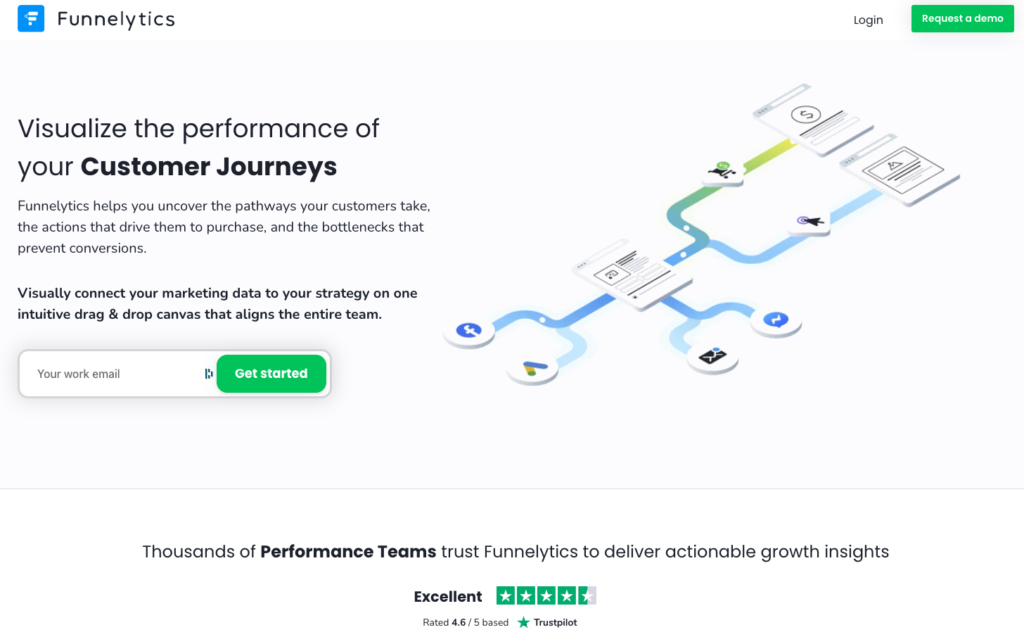
To start a funnel visualization with Funnelytics, simply sign up for a free account and then click on the “Templates” tab. From there, you can browse through the funnel templates and select the one that best suits your data. Once you’ve found a funnel template that you like, simply click on it and then enter your data into the template. The funnel chart will be generated automatically. You can then use the funnel chart to compare your funnel data over time and identify any trends or changes in your customer behavior.
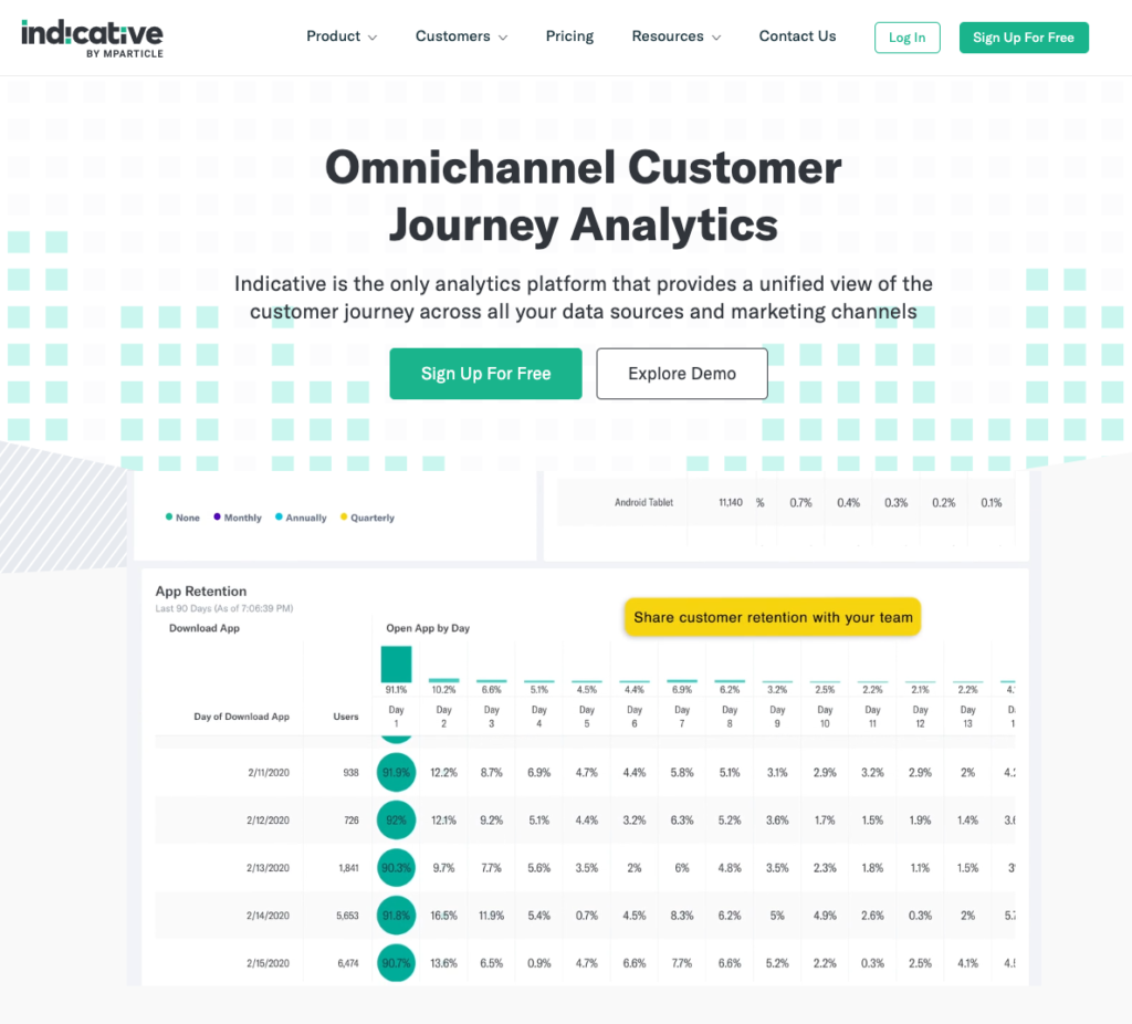
Indicative by Mparticle
It’s an all-in-one funnel chart software that’s easy to use and comes with a wide range of features. Indicative is my second top pick because it’s the most user-friendly funnel chart software and it has a free plan. Plus, it comes with a library of funnel templates that you can use to quickly create funnel charts and an easy intuitive dashboard.
Google Analytics with Google Data Studio
If you’re looking for a more advanced funnel chart solution, you can use Google Analytics with Google Data Studio. Google Analytics is a free web analytics tool that you can use to track your website traffic. Data Studio is a data visualization tool that you can use to create funnel charts and other types of charts. To get started, simply connect your Google Analytics account to Data Studio. Once you’ve done that, you can then create any report.
The Final Word – Interpreting funnel chart data
Once you’ve identified some weak points in your funnel, it’s time to take action. This may involve making changes to your website, tweaking your marketing campaigns, or trying something new altogether.
Whatever you do, just make sure you’re constantly testing and iterating to ensure that you’re funnel is as efficient as possible.
When interpreting funnel chart data, there are a few things to keep in mind:
– The number of people at each stage of the funnel
– The percentage of people who progress from one stage to the next
– The average time it takes people to progress from one stage to the next
– The number of people who drop off at each stage of the funnel
– The percentage of people who drop off at each stage of the funnel
– The average time it takes people to drop off at each stage of the funnel
These are just a few things to keep in mind when interpreting funnel chart data. By keeping these things in mind, you’ll be able to identify any weak steps in your funnel and take action to improve them.
If you follow the steps in this blog post, you should be able to improve your funnel conversion rates in no time.
Just remember to track your data correctly and choose the right software for funnel data visualization.
Good luck!